Colour and White Balance as Narrative Tools
Colour as an organizational choice
Colour is more than decoration; it structures attention. The way colours are arranged affects perceived hierarchy, mood, and emotional resonance. White balance settings and palette choices are compositional tools that help an observer decide what should dominate and what should recede. Approaching colour intentionally is a slow, practical way to refine visual storytelling.
White balance: technical choice, narrative consequence
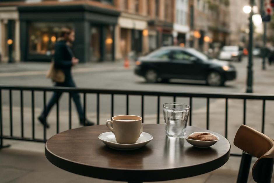
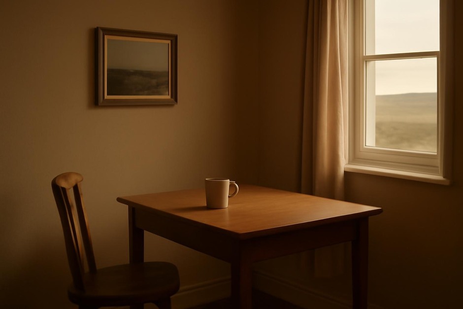
White balance controls colour temperature and can be treated as a narrative decision. Warmer temperatures—those leaning toward amber and gold—often feel intimate or nostalgic. Cooler temperatures suggest detachment or clarity. Technical correction is available, but choosing a particular white balance can align the image with a mood. When working across a sequence, consistent white balance helps maintain tonal coherence.
Limited palettes and focal colour
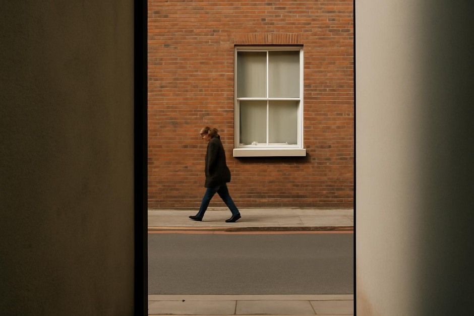
Limiting the number of dominant colours simplifies visual information and strengthens hierarchy. A restrained palette allows a single accent colour to become a focal point. Look for recurring hues in the environment—an orange sign, a blue jacket, a green door—and consider composing so these accents punctuate the frame. Harmony can be achieved through complementary or analogous colour relationships; balance can be created by repeating small touches of a focal colour across the image.
Subtle shifts and perceived temperature
Small changes in hue or saturation can shift the perceived temperature of a scene. Muted, desaturated colours often read as quiet and reflective. Saturated tones impart energy and immediacy. Observers who want a coherent body of work may choose a preferred saturation level and use it as a guiding parameter during capture or editing. The choice should align with the intended affect: calm restraint or vibrant presence.
Material colour and texture interaction
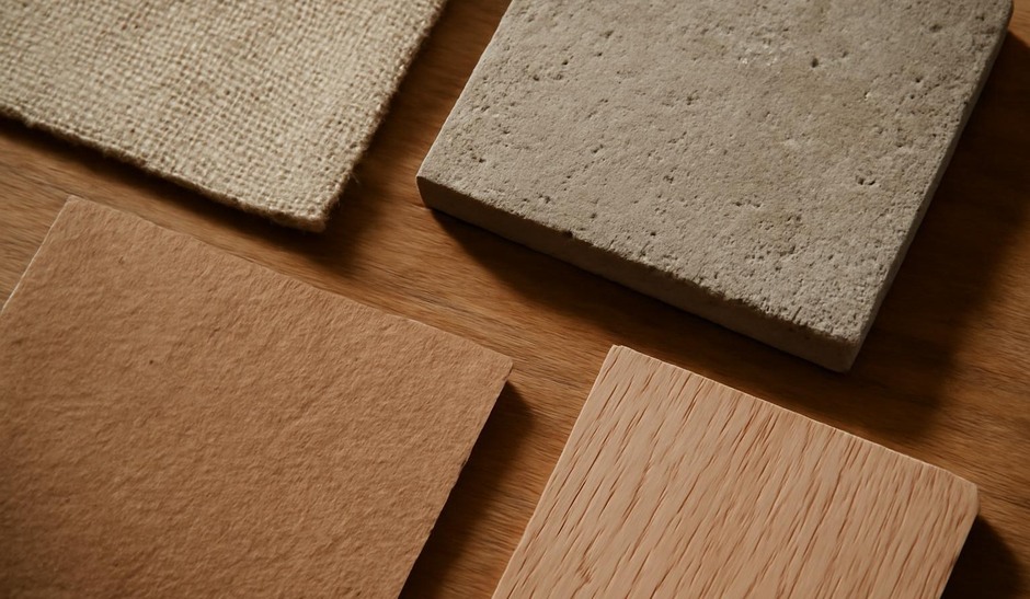
Colour interacts with materiality. A glossy surface will reflect highlights and colours from surrounding elements, while matte textures may mute and absorb light. Understand how materials translate colour under different light: the same red object will look different under warm indoor light versus cool daylight. Paying attention to these interactions helps in deciding how to position objects or which angle to use to emphasize desired chromatic relationships.
Practical habits for colour awareness
- Observe limited palettes in daily life and make small collections of images that share a dominant hue.
- Experiment with manual white balance or presets to see how temperature shifts alter mood.
- Create sequences that keep colour consistent to compare narrative effects.
Colour and white balance are quiet levers. Used thoughtfully, they can turn ordinary scenes into work that feels cohesive and intentional. The practice is not about chasing visual trends but about developing a clear, steady vocabulary that supports long-term observation and subtle storytelling.